Adaptive Virtual Assistant

Improving independence, inclusion and connectivity for retired Canadians and older immigrants.
Overview
Many older adults and Canadian immigrants in low income households struggle with independence and connection to their caretakers and family. They often lack confidence when navigating the digital space using smart devices.
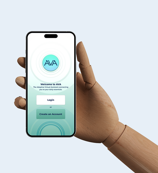
AVA, the Adaptive Virtual Assistant, is a mobile app that streamlines communication and connectivity, serving as a central hub for medicine reminders, daily tasks, transportation, and quick access to smart devices.
Beyond its AI voice assistant, AVA offers additional core features such as: medicine reminders with easy contact to caretakers, doctors, and close family members, smart device connectivity and control, speed-dial for shuttle transportation, and closed-caption audio reading.
Over four weeks, our team carried out a competitor analysis and desk research, reviewing scholarly articles, statistics, and studies to asses what was currently available in the market. User interviews further influenced features for AVA during the ideation phase. I led the design and prototyping of AVA’s user interface as the team's lead designer.

Time
12 Weeks Collaboration
2 UX Designers, 3 Web Developers
Tools
Figma, Figjam, Procreate
Role
UX Designer, Illustrator
Tasks
Desk Research, Competitor Analysis, Affinity Map, Survey, Wireframe and Prototype
Discover
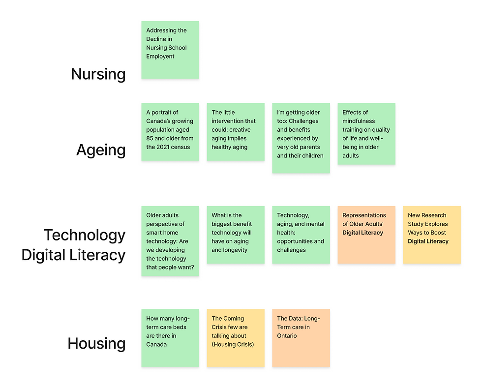
During the ideation process, we ran a brief workshop that led to a competitor analysis, generating several design directions for AVA. At one point, our team explored the concept of Smart Glasses.
Through desk research, we honed in on the bigger picture: as many smart devices are still complicated for older adults to use, there is an opportunity to design an app that simplifies and helps them navigate these technologies more easily.
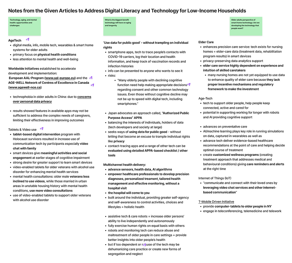


Competitor Analysis
Our research identified a range of smart glasses at varying price points, aligning with AVA's initial design. But in the end, we shifted focus towards the connectivity aspect and a more cost-effective solution.
I sketched AVA's initial concept as smart glasses, while our team explored that direction. Following our research, we shifted gears to the structured app.


User Interviews & Surveys
I developed the interview questions and survey, and after a week of data collection, results showed that participants were active older adults in their late 60s, always up on their feet engaging in hobbies or taking walks. This insight informed our ideation process, leading us to the inclusion of a "Tasks" feature to support daily activities.
Design
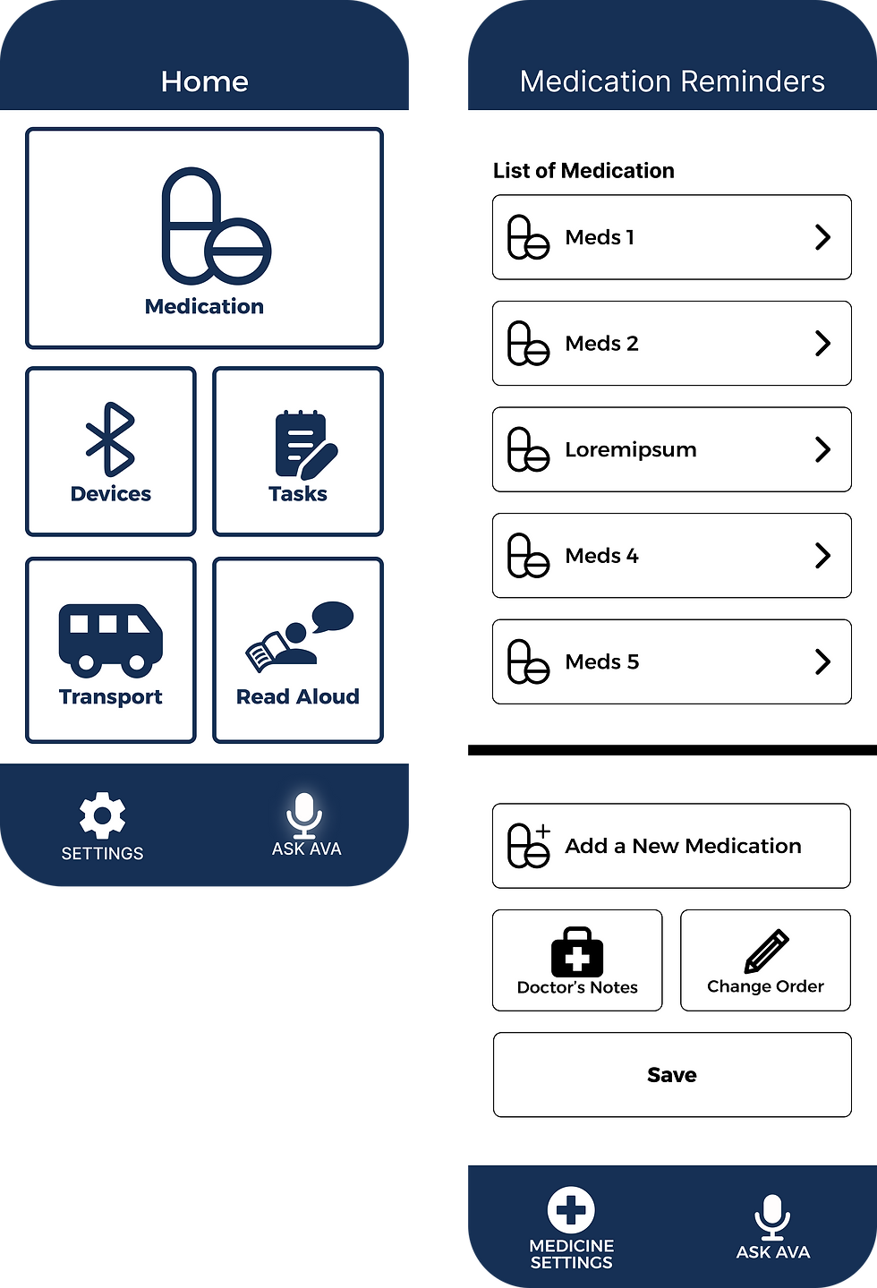
The primary user flow focuses on medicine reminders, displaying the input of prescriptions from caretakers and doctors, to call features that connect users with close family members.
The secondary user flow centres on seamless integration of smart devices into a single hub, allowing users to easily access and control them with additional support from AVA and her voice assist, or they can easily choose to contact their caretaker.
Additional user flows in the prototype include the Quick Dial for transport, and Read Aloud for closed captioned audio.
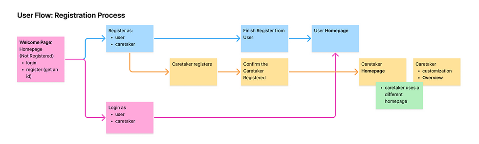

We focused on the senior user flow for this project, and I made a few iterations of the low fidelity wireframes highlighting AVA's features: medication reminders, quick dial for transport, and closed caption.


Caretaker User Flow
Due to time constraints within the project’s production timeline, the feature for Tasks that sets hobby and activity reminders was not fully showcased, nor was the complete Caretaker user flow, including the Client Overview.
However, I created low fidelity wireframes for the Caretaker Overview, illustrating the journey of checking a client's medication.
Mid-fidelity Design
During user testing of the mid-fidelity prototype, participants voiced their feedback that carried areas of confusion and suggestions for the team.
Testing Results:
-
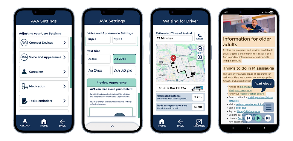
Clearer distinction needed with the General Settings and Medicine Settings
-
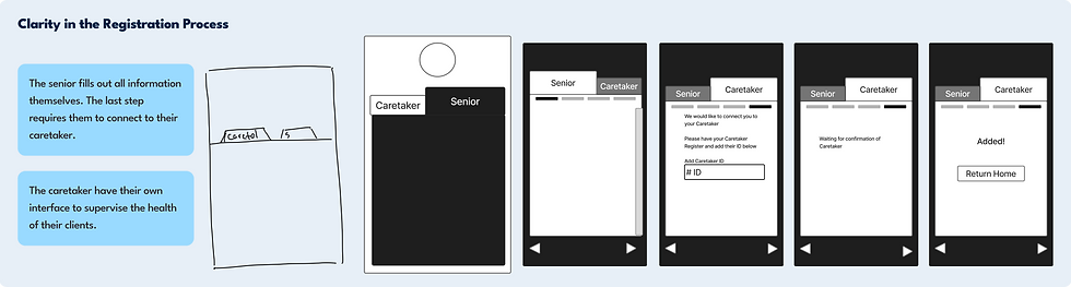
Confusion at the Registration Process between Caretaker and Senior
-
Contact, Fare and other information should be shown to ensure user comfort in the Quick Dial Transportation
I suggested using module tabs in the Registration Process to reinforce clarity and user navigation.
Final Design
Throughout the design, I emphasized contrast and accessibility. Text size can be customized in the General Settings to accommodate user needs, and buttons are sharpened with outlines.
Modernity for Clarity
AVA captures a modern, cool-tone palette, blending shades of minty green and blue to reflect the health and technological aspect of the app. Green is used to state completion and highlight primary action, while dark blue is used for the body text to be easy on the eyes. Icons are paired with clear labels for comprehension, and warm red is used sparingly to draw attention to alerts and important information.
Feedback for Navigation
Progression meters, pagination components, and scroll bars help users clearly understand their position and navigation in the app. I also made subtle animations to indicate automatic organization, especially when managing the list of medication and connected devices.

Impact
75% - 90%
Accessibility Engagement Rate
Available features acclaimed for simplicity, usefulness and clear instruction. Users also expressed interest in AVA's voice system, alongside positive feedback on the visual design for accessibility and speech.
91%
Task Completion Efficiency
Users were able to complete key tasks, such as checking medication reminders and requesting transportation, with low error rate and reduced average completion time.
+80%
Navigation Confidence and Ease of Use
Visual feedback elements, along with progression meters and pagination, proved highly effective in supporting confident user navigation. Medication reminders and customization features built for primary users were both discoverable and actively used with direction.
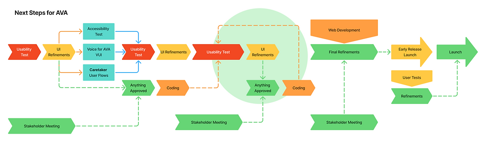
The next steps I charted for the usability testing phase, UI refinements, implementation of the caretaker user flows, and voice interaction testing for AVA. Once we complete stakeholder reviews, the web development team can proceed to coding and testing the approved elements of the prototype.
Learnings
The project with AVA showed us the importance of adapting quickly when the direction of a design shifts. As a team, we learned to face the challenge in time constraints and research prioritization. When our concept evolved from smart glasses to a mobile app, the early research efforts needed to be reconstructed for the new direction. There was not enough time to conduct additional competitor analysis and user interviews after the pivot, which resulted in more time dedicated for the smart glasses concept, compared to the mobile app design.
I learned the importance of early decision-making and understanding of the scope and research, so our design choices are more focused throughout the project.